Purpose and Meaning: In this section, I will explain clearly about the visual effect and transition that I have used in this short film - Here After Us. For visual effects, I have used mostly colour correction and contrast to make the better quality of the short film. I have also used 'Additive Dissolve' and 'Dip to Black' for the transition of the some of the clips and title text box.
This is the beginning of the short film, we used aerial photographing of some building to be the opening. We did this because we liked to make a movie trailer at first, but we found out that we filmed too much footage for a trailer, it was too detailed. Then we decided to change our topic into a short film.
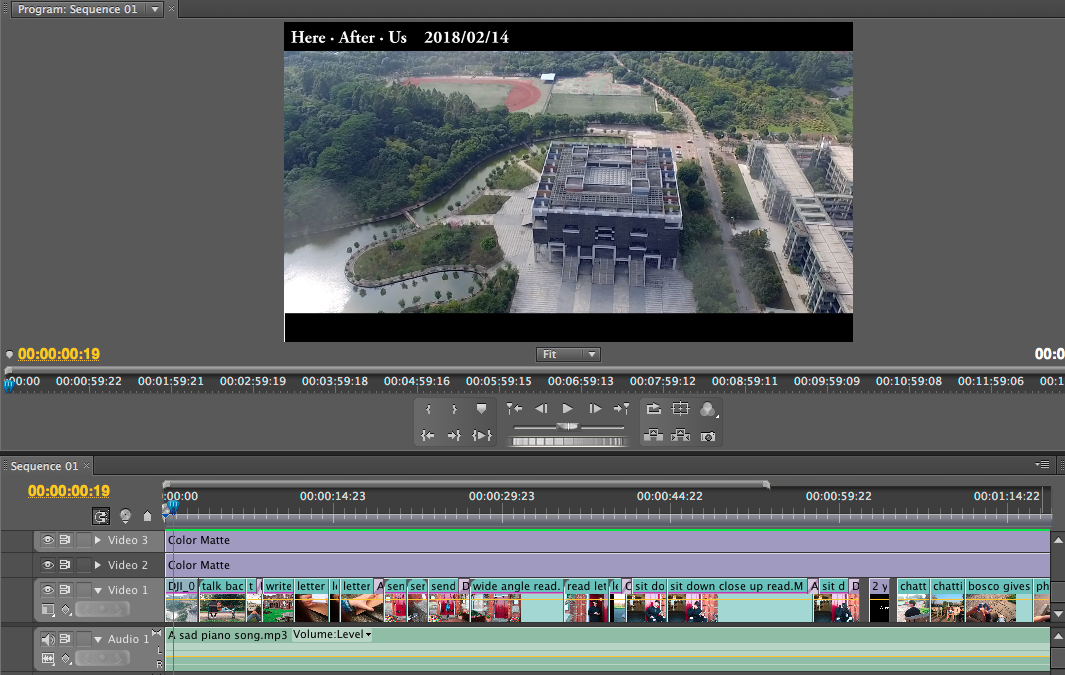
These three screenshots are the timeline of my edition. As you can see, I named every footage, that helps me to have a well organise through the whole process. If you see there are some purple lines under the name of a clip, that are the evidence that I have used visual effects (Colour correction, Brightness & Contrast), Colour Balance HLS, transitions (Additive dissolve, Dip to Black). They are probably are all the effects that I have used for this short film. There are also three purple lines on the top of the clips; the first one is the 'Here After Us 2018/02/14' of the short film at the top, and the other two are the black banners of the top and bottom side of the short film.
These can be found at the left of the edition line, which is called Effect Controls.
I used this clip as an example. I put Brightness & Contrast as I think this clip is a bit bright at the back, maybe it is because the weather was sunny that day. I adjusted the brightness into -17.5, then I put contrast into -4.9 to balance the brightness that I have changed. I also put a transition 'Dip in Black' at the back of the clip as this is the end of the scene, this gives a meaning of ending of one scene to the audiences.


No comments:
Post a Comment